E-Commerce Dashboard Guide: How to Use Analytics to Grow Your Business
An e-commerce dashboard is a powerful analytics tool that helps you track sales, monitor customer behavior, optimize conversion rates, and improve business performance. In this complete guide, you’ll learn how to use an ecommerce analytics dashboard to make data-driven decisions, increase revenue, and scale your online business.
Why Your Business Needs an Analytics Dashboard
Running an e-commerce business without data is like driving blind. Every click, order, and customer interaction generates valuable insights. Without a proper dashboard, you risk missing opportunities and making slow decisions.
The Docynx dashboard helps you convert raw data into meaningful insights so you can make smarter, faster, and more profitable decisions.
Table of Contents
Key Features
Real-Time Sales Analytics
Monitor revenue, track orders, and analyze performance trends instantly.
Customer Insights
Understand customer behavior, retention, and buying patterns.
Inventory Tracking
Track stock levels, get alerts, and optimize your inventory efficiently.
Business Reports
Analyze profit, expenses, and growth with powerful reports.
Benefits of Using Docynx Dashboard
✔ Make faster data-driven decisions
✔ Increase revenue and profitability
✔ Reduce manual reporting work
✔ Improve customer retention
✔ Identify growth opportunities instantly
Turn Data into Growth
Unlike traditional dashboards that only display numbers, Docynx provides insights that help you take action. From identifying top-selling products to analyzing customer drop-offs, everything is designed to help your business grow.
Whether you're a small seller or scaling to millions in revenue, this dashboard adapts to your needs and helps you stay ahead of the competition.
Start Exploring Today
Experience the power of real-time analytics and take control of your business.
Complete Dashboard Breakdown
An e-commerce dashboard is the brain of your business. It converts raw data into actionable insights — helping you make better decisions, increase revenue, and improve customer experience.
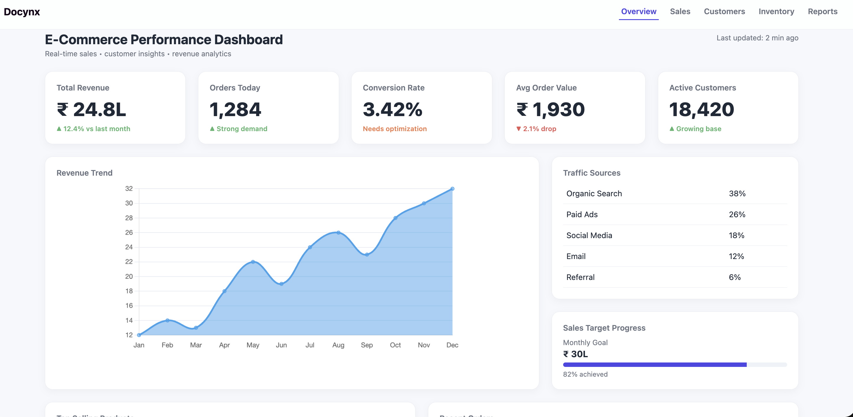
1. Overview Section (Quick Business Health Check)
This is the most important section of your dashboard. Think of it as your business heartbeat — in just a few seconds, you should know whether your business is growing, slowing down, or facing issues.
Instead of checking multiple reports, this section gives you a real-time snapshot of performance across revenue, customers, and sales efficiency.
Key Metrics Explained (With Examples)
Total Revenue
Total money generated from all orders.
Example: ₹24.8L this month vs ₹22L last month → growing business.
Why it matters: Measures overall business growth.
Orders Today
Total number of orders placed today.
Example: 1,284 orders today vs 900 yesterday → demand spike.
Why it matters: Helps track daily performance and campaign impact.
Conversion Rate
% of visitors who actually buy.
Example: 3% means 3 out of 100 visitors purchase.
Why it matters: Shows how effective your website is.
Average Order Value (AOV)
Average revenue per order.
Example: ₹1,930 per order.
Why it matters: Higher AOV = more revenue without more customers.
👥 Active Customers
Users actively browsing or buying.
Example: 18,420 active users this month.
Why it matters: Indicates engagement and brand growth.
High traffic + low conversion = problem in website UX, pricing, or trust.
Example: 10,000 visitors but only 100 orders → your site is leaking customers.
- Improve product pages (images, reviews, descriptions)
- Simplify checkout process
- Add trust signals (ratings, COD, return policy)
Revenue Trend (Growth Direction)
The revenue trend chart shows how your business performs over time — daily, weekly, or monthly.
It helps you identify:
- Growth trends
- Seasonal spikes (festivals, sales)
- Sudden drops (technical issues, ad failure)
Revenue spikes during Diwali → plan inventory & ads early next year.
- Increase marketing during high-performing periods
- Investigate sudden drops immediately
Traffic Sources (Where Customers Come From)
This shows how users are finding your store — crucial for marketing decisions.
🔍 Organic
Visitors from Google search.
Meaning: Strong SEO = free traffic.
Paid Ads
Traffic from ads (Google, Meta).
Meaning: Scalable but costs money.
📱 Social Media
Traffic from Instagram, Facebook, etc.
Meaning: Brand awareness & engagement.
If paid ads = high traffic but low sales → you're burning money.
- Optimize ad targeting
- Improve landing pages
- Focus on high-converting channels
Sales Target Progress (Goal Tracking)
Tracks how close you are to achieving your monthly revenue goal.
Example: ₹30L target → 82% achieved → you're on track.
🔥 Top Products (Revenue Drivers)
Shows which products are generating the most sales.
Example: Wireless Earbuds = 1,240 sales → high demand product.
80% of revenue often comes from top 20% products (Pareto Principle).
- Run ads on best-selling products
- Bundle them with low-performing products
- Maintain high stock availability
2. Sales Dashboard (Revenue & Profit Analysis)
This section answers the most important business question: “Am I actually making money — or just generating sales?”
While the Overview shows growth, the Sales Dashboard shows profitability, efficiency, and revenue quality.
Important Metrics (With Examples)
💵 Gross Sales
Total revenue before deductions (discounts, refunds, costs).
Example: ₹18.2L total sales this month.
Why it matters: Shows demand but not actual profit.
Net Profit
Actual earnings after all expenses.
Example: ₹6.4L profit → healthy margin.
Why it matters: This is your real business success.
↩️ Refunds
Revenue lost due to returns or cancellations.
Example: ₹82K refunds → potential problem.
Why it matters: High refunds = product or expectation mismatch.
Completed Orders
Successfully delivered orders.
Example: 8,421 orders fulfilled.
Why it matters: Indicates operational efficiency.
High sales but low profit = too many discounts, high ad cost, or operational inefficiency.
- Reduce unnecessary discounts
- Optimize ad spend (focus on ROI)
- Improve logistics and packaging costs
Conversion Funnel (Customer Journey Analysis)
This shows how users move step-by-step before purchasing:
Visitors → Product Views → Add to Cart → Checkout → Purchase
Each step represents a drop-off point where potential customers leave.
5,000 visitors → 3,200 views → 1,800 carts → 900 checkout → 620 purchases
Biggest drop at checkout → problem area.
- Enable fast checkout (1-click / guest checkout)
- Show total price upfront (avoid surprise costs)
- Add trust badges, reviews, and return policy
Sales Channels (Where Revenue Comes From)
This shows which platforms generate your sales.
Website
Direct sales from your store.
Benefit: Higher margins, full control.
Marketplace
Amazon, Flipkart, etc.
Benefit: High reach but lower margins.
📱 Mobile App
Sales from your app users.
Benefit: High retention and repeat purchases.
🏬 Retail
Offline or physical store sales.
Benefit: Builds brand trust.
Diversified channels = lower risk and more stable revenue.
- Double down on highest-performing channel
- Fix low-performing channels or cut them
- Build your own website to increase margins
💳 Payment Methods (Customer Preference Insights)
Shows how customers prefer to pay — critical for conversion optimization.
Example Split: UPI (46%), Cards (24%), COD (8%)
High COD orders → higher return risk and operational cost.
- Optimize checkout for top payment methods (UPI, Cards)
- Offer discounts for prepaid orders
- Limit COD for high-risk orders
3. Customer Analytics (Growth & Retention)
This section answers a critical question: “Are customers coming back — or leaving after one purchase?”
Most businesses focus only on acquiring new users, but real profitability comes from retention, repeat purchases, and customer lifetime value (CLV).
👥 Key Metrics (With Examples)
🆕 New Customers
Number of first-time buyers.
Example: 2,140 new users this month.
Why it matters: Shows marketing and acquisition strength.
🔁 Returning Customers
Users who made repeat purchases.
Example: 11,280 repeat buyers.
Why it matters: Indicates loyalty and brand trust.
📉 Churn Rate
% of customers who stop buying.
Example: 8.4% churn rate.
Why it matters: High churn = lost revenue opportunity.
Acquisition brings growth, but retention brings profit.
Example: Spending ₹1,000 to acquire a customer who buys only once = loss Same customer buying 3 times = profit
- Launch email/SMS remarketing campaigns
- Offer discounts on second purchase
- Create loyalty or reward programs
Customer Segmentation (Know Your Audience)
Not all customers are equal. Segmenting helps you focus on the most valuable users.
💎 High Value
Spend the most and buy frequently.
Strategy: VIP offers, early access, exclusive deals.
Mid Value
Regular customers with steady purchases.
Strategy: Upsell & cross-sell products.
🪙 Low Value
Occasional buyers.
Strategy: Discounts & bundle offers.
At Risk
Haven’t purchased recently.
Strategy: Win-back campaigns & reminders.
Top 20% customers often generate 80% revenue (Pareto Principle).
- Identify and prioritize high-value customers
- Run personalized campaigns for each segment
- Track behavior (purchase frequency, spend)
Customer Satisfaction (Experience Quality)
Measures how happy customers are across key areas:
- Delivery speed
- 📞 Customer support
- Product quality
- Pricing & value
- Overall experience
Example: If delivery score = 88 but pricing = 76 → customers feel it's expensive.
Bad delivery or poor support = fewer repeat customers and negative reviews.
- Improve delivery timelines
- Provide fast customer support
- Collect feedback after every order
- Fix common complaints quickly
Customer Behavior Insight
Understanding behavior helps you predict future sales.
Example: Customers who place a second order are 3x more likely to become long-term buyers.
- More customers ≠ more profit
- Repeat customers = higher margins
- Retention is cheaper than acquisition
4. Inventory Management (Stock Control)
This section answers a critical operational question: “Do I have the right products, in the right quantity, at the right time?”
Inventory is where most businesses silently lose money — either by running out of stock (lost sales) or overstocking (blocked capital).
Key Metrics (With Examples)
Low Stock
Products that are about to run out.
Example: 82 items below threshold.
Why it matters: Risk of missing upcoming sales demand.
Out of Stock
Products completely unavailable.
Example: 24 items unavailable.
Why it matters: Direct revenue loss + poor customer experience.
Inventory Value
Total money invested in stock.
Example: ₹48.6L tied up in inventory.
Why it matters: High value = capital locked, impacts cash flow.
Out-of-stock products don’t just lose one sale — they can lose the customer forever.
- Set low-stock alerts and automate restocking
- Prioritize high-demand product availability
- Maintain buffer stock for top-selling items
Stock Movement (Demand Speed)
This tracks how quickly your products are selling over time.
Example: Wireless Earbuds selling 150 units/week → high demand Yoga Mats selling 10 units/week → slow demand
Fast-moving products = scale aggressively Slow-moving products = optimize or clear out
Slow-moving inventory blocks cash that could be used for marketing or scaling winners.
- Increase ads & stock for fast-selling products
- Bundle or discount slow-moving items
- Stop reordering poor-performing products
🏬 Warehouse Distribution (Stock Allocation)
This shows how your inventory is distributed across warehouses or locations.
Example: Warehouse A (34%), Warehouse B (28%), Warehouse C (22%)
Proper distribution ensures faster delivery and lower logistics cost.
Better stock placement = faster delivery = higher customer satisfaction.
- Store high-demand products closer to key cities
- Balance stock across warehouses to avoid delays
- Reduce overstock in low-demand regions
Advanced Inventory Insight (Where Profit Hides)
Inventory is not just about stock — it's about cash flow and efficiency.
Example: ₹10L stuck in unsold products = lost opportunity to run ads or launch new products.
The faster your inventory sells, the faster your business grows.
5. Business Reports (Big Picture Decisions)
This section is where everything comes together. It answers the most important question: “Is my business truly growing — and is it sustainable?”
While other sections show day-to-day performance, this section focuses on long-term strategy, profitability, and financial health.
Key Metrics (With Examples)
Total Revenue
Total income generated over a period.
Example: ₹2.8 Cr yearly revenue.
Why it matters: Measures overall scale of business.
Total Profit
Earnings after all expenses.
Example: ₹86L profit.
Why it matters: Real indicator of business success.
💸 Expenses
All operational costs (ads, logistics, salaries).
Example: ₹1.2 Cr expenses.
Why it matters: High expenses reduce profitability.
Profit Margin
% of revenue that turns into profit.
Example: 30.7% margin.
Why it matters: Shows efficiency and sustainability.
Revenue growth without profit = unhealthy business.
Example: ₹1 Cr revenue with ₹95L expenses = high risk, low sustainability.
- Track and reduce unnecessary expenses
- Focus on high-margin products
- Optimize ad spend based on ROI
📉 Revenue vs Expenses (Profitability Trend)
This chart compares how much you earn vs how much you spend over time.
Example: Revenue = ₹32L, Expenses = ₹18L → Strong profitability Revenue = ₹32L, Expenses = ₹30L → Risk zone
If expenses grow faster than revenue → profits will shrink.
- Audit major cost areas (ads, logistics, returns)
- Cut low ROI campaigns
- Improve operational efficiency
Yearly Growth (Scaling Direction)
This shows how your business is growing year over year.
Example: 2023 → ₹1.2 Cr 2024 → ₹1.6 Cr 2025 → ₹2.1 Cr 2026 → ₹2.8 Cr
Consistent upward growth indicates a scalable and stable business.
Steady growth with stable profit margins = strong business foundation.
- Reinvest profits into scaling (ads, new products)
- Plan inventory based on growth trends
- Prepare for seasonal spikes
Advanced Business Insight (Think Like a Founder)
At this stage, you should move from operator mindset → owner mindset.
Instead of asking: “How much did I sell?” Start asking:
- Are my margins improving?
- Is my growth sustainable?
- Where am I losing money?
A business that controls costs grows faster than a business that only chases revenue.
Final Takeaways
- Revenue tells you growth
- Conversion tells you efficiency
- Customers tell you sustainability
- Inventory tells you operations
- Reports tell you long-term success
A powerful dashboard is not just for viewing numbers — it’s a decision-making tool that can scale your business when used correctly.
© 2026 Docynx • E-Commerce Analytics Guide • Built for smarter e-commerce growth